El remake del New York Times Spiral Graph en R

dataviz in action
Autor/a

Paula LC

Fecha de publicación

8 de enero de 2022

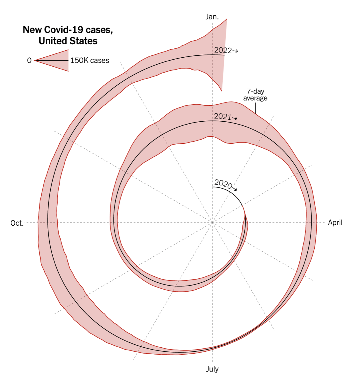
El New York Times publicaba un gráfico el pasado día 6 sobre el número de casos de COVID19 en Estados Unidos. El gráfico despertó numerosas opiniones debido a su peculiar y, sin duda, original forma de presentar los datos.

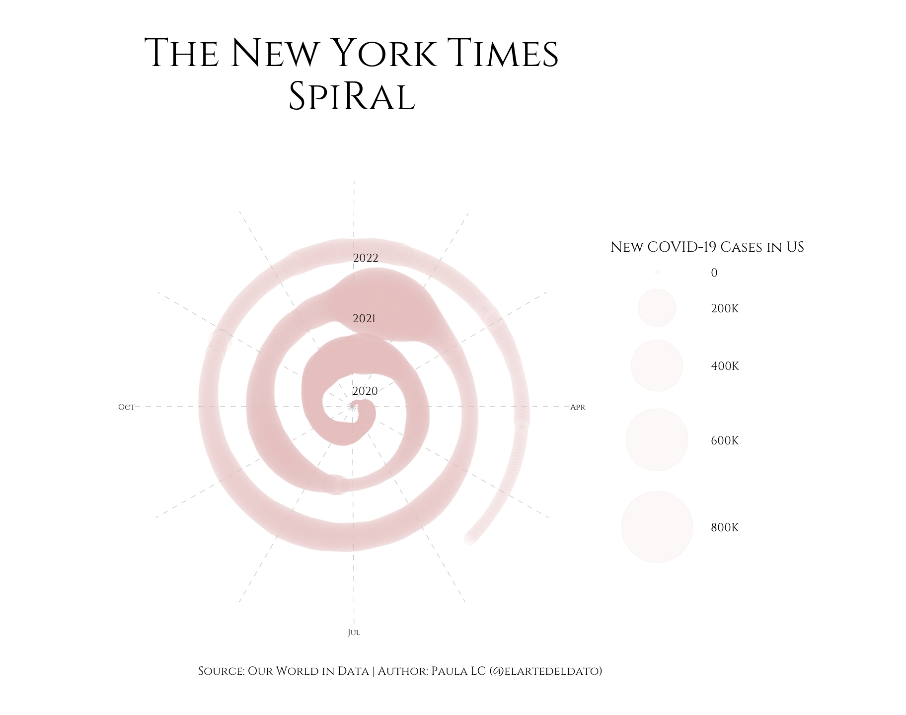
También se generaron algunas versiones que, según la opinión general, mejoraban el original:

Desde aquí hemos querido hacer nuestra propia versión en R, utilizando geom_point() de ggplot.

library(ggplot2)
library(dplyr)
library(lubridate)
library(scales)

# Data
df <- read.csv('https://covid.ourworldindata.org/data/owid-covid-data.csv')
df %>%
  filter(location == 'United States') %>%
  select(date, new_cases_smoothed) -> df_us

df_us$date <- as.Date(df_us$date)
df_us$year <- year(df_us$date)
df_us$month <- month(df_us$date)
df_us$day <- day(df_us$date)

# Plot
ggplot(df_us) +
  geom_point(aes(x=interaction(day, month), y=date, size=new_cases_smoothed), alpha=0.1, color='#E5C7C6')  +
  annotate(geom='text', label='2020', x='1.1', y=as.Date('2020-01-01'), vjust=-1.5, hjust=0, family='Cinzel', size=3) +
  annotate(geom='text', label='2021', x='1.1', y=as.Date('2021-01-01'), vjust=-4, hjust=0, family='Cinzel', size=3) +
  annotate(geom='text', label='2022', x='1.1', y=as.Date('2022-01-01'), vjust=-5, hjust=0, family='Cinzel', size=3) +
  scale_x_discrete(breaks=paste(1,1:12, sep='.'), labels=c('', '','','Apr', '','','Jul', '','','Oct','','')) +
  scale_size(name='New COVID-19 Cases in US', range=c(1,25), labels = label_number_si()) +
  coord_polar() +
  theme_void() +
  theme(panel.grid.major.x=element_line(size=0.05, color='black', linetype = 'dashed'),
        axis.text.x = element_text(color='black', size=6),
        plot.title=element_text(hjust=0.5, size=30,  margin=margin(0,1,1,0, 'cm')),
        text=element_text(family='Cinzel', color='black'),
        plot.margin=margin(1,1,1,1, 'cm'),
        plot.background=element_rect(fill='white', color='white')) +
  labs(title='The New York Times\nSpiRal', caption='Source: Our World in Data | Author: Paula LC (@elartedeldato)')

Para guardarlo con las medidas exactas de gráfico:

ggsave('the_nyt_spiral.png', height = 7.5, width = 9.5)

¿Te animas a hacer tu propia versión?

Contenido relacionado